Introducing astro-erudite v2

I've rebuilt my blogging template from scratch, and it's better in every way I know how to measure.

Introduction
On September 10, 2024 (634 days ago!) I ventured to build myself my perfect template. I wanted it to be the Phillips screwdriver of my toolkit that I would take to any project. I took the stack that I loved using, all the libraries I knew inside-out, the utilities I perpetually used, and bundled it into a neat package that I open-sourced for the world. The reception was enthusiastic (thanks for 750 stars!), and since then I’ve seen dozens of cool projects pop up. I’m so glad I got to facilitate creating personal spaces for others around the internet.
After I released astro-erudite, I stepped away from open-source for a while to work on my personal business (and later to work a 9-5). In the couple of years since then, I’ve picked up so much knowledge across so many different subsets and microcosms of web design: typography, color theory, accessibility, art direction, UX. My intuition and my experience have grown so much alongside the love for my craft.
When I recently used this project as the base for some client work, I soon realized how many fundamentally poor decisions I’d made when initially creating it. My tastes had changed and my opinions had shifted so drastically that I felt the project was no longer serving its original purpose: to be my Phillips screwdriver. I decided to rebuild it from a fresh folder.
What you are now looking at is the culmination of all the lessons I’ve learned throughout my years as a design engineer. I apologize for not getting to this quicker and I regret having shipped out such a subpar project. This blog post will explain the fundamental issues I had with the original version, and how the new version addresses them. Later on I’ll also talk about breaking changes, and how to convert existing v1 projects into v2.
Benchmarks
The description of this post claims that v2 is better in every way I know how to measure, so here are the measurements. Both versions were benchmarked with the same blog posts on the same machine:
| v1 | v2 | Δ | |
|---|---|---|---|
| JavaScript shipped | 253kb | 6.5kb | ↓97% |
| Largest JavaScript file | 169.8kb (React) | 2.4kb (ToC) | ↓99% |
| CSS shipped | 76kb | 24.2kb | ↓68% |
| Homepage transfer size | 293kb | 216kb | ↓26% |
| Homepage requests | 14 | 7 | ↓50% |
| Homepage main-thread work | 0.43s | 0.12s | ↓72% |
| Series read: page loads | 6 | 1 | ↓83% |
| Series read: transfer | 669kb | 546kb | ↓18% |
| Build time (warm) | 6.1s | 1.2s | ↓80% |
| Build time (per page) | 303ms | 67ms | ↓78% |
| Direct dependencies | 33 | 13 | ↓61% |
| Installed packages | 636 | 294 | ↓54% |
node_modules size |
334mb | 174mb | ↓48% |
The series rows measure reading every post of the v1 release series end to end. v1 needs a full navigation per subpost, while v2 renders the whole chain as one continuous page.
Gripes, remediations
The format of this blog post will be simple: I will first talk about something I dislike, and then I will talk about how I got rid of it. If I used to like it, I will talk about what changed my mind.
Regarding dependency hell
In general, a good statistic that quantifies the “weight” of a project is its dependencies. This is only natural. astro-erudite v1 (which I will now just call v1 for brevity) had 33 direct dependencies (devDependencies included). v2 reduces this by 61%, down to 13.
Note
installed packages for v1 versus 294 for v2. A bare astro install is 254
packages on its own, so of the part of the tree I actually control, v1 stacked
~382 packages on top of Astro, and v2 adds 40. :::
The following is our package.json diff showing the changes:
"dependencies": { "@astrojs/check": "0.9.7", "@astrojs/markdown-remark": "7.0.0", "@astrojs/markdown-satteri": "^0.2.1", "@astrojs/mdx": "5.0.0", "@astrojs/react": "5.0.0", "@astrojs/rss": "^4.0.18", "@astrojs/sitemap": "^3.7.3", "@expressive-code/plugin-collapsible-sections": "^0.42.0", "@expressive-code/plugin-line-numbers": "^0.42.0", "@iconify-json/lucide": "^1.2.26", "@shikijs/rehype": "^3.4.0", "@tailwindcss/vite": "^4.0.7", "@types/react": "19.0.0", "@types/react-dom": "19.0.0", "astro": "^6.4.2", "astro-icon": "^1.1.5", "class-variance-authority": "^0.7.1", "clsx": "^2.1.1", "github-slugger": "^2.0.0", "hast-util-select": "^6.0.4", "hast-util-to-html": "^9.0.5", "hastscript": "^9.0.1", "lucide-react": "^0.469.0", "radix-ui": "^1.3.4", "react": "19.0.0", "react-dom": "19.0.0", "rehype-expressive-code": "^0.40.2", "rehype-external-links": "^3.0.0", "rehype-katex": "^7.0.1", "remark-emoji": "^5.0.1", "remark-math": "^6.0.0", "satteri-expressive-code": "^0.1.8", "tailwind-merge": "^3.3.0", "tailwindcss": "^4.1.7", "temml": "^0.13.3" "typescript": "^5.8.3"},"devDependencies": { "@biomejs/biome": "^2.4.16" "prettier": "^3.5.1", "prettier-plugin-astro": "^0.14.1", "prettier-plugin-astro-organize-imports": "^0.4.11", "prettier-plugin-tailwindcss": "^0.6.11"}We can divvy our removed packages into four categories:
- Things that existed to render HTML that I could have totally done myself.
react,react-dom,@astrojs/react,@types/react,@types/react-dom,radix-ui: I’ve completely removed shadcn/ui from this project. I basically was only using<Avatar>,<ScrollArea>, and<Pagination>, which we can own ourselves for much cheaper. Ownership is a principle that I now really enjoy, and even though shadcn/ui kind of claims “ownership” as its leading philosophy (you are, after all, copying the components yourself), these come baked in with Radix and Lucide and so you don’t really own anything (this says a lot about our society). There’s absolutely no point bundling these.lucide-react,astro-icon,@iconify-json/lucide: These are icon libraries that shadcn/ui was also using. I’ve learned to opt out of these icon libraries (which are more DX than anything) and to simply have SVGs in anicons/folder with the ones we actually use.
- Things that existed to manage and fix issues with other things shouldn’t have existed in the first place. These are all things that don’t actually do anything to the website, but rather do things to each other.
tailwind-merge,clsx,class-variance-authority: These are utility libraries that all mutate and fiddle around with Tailwind in specific ways. These are now entirely useless, because I’ve removed Tailwind!typescript,@astrojs/check: These were used in the old build script that ranastro check && astro buildinstead of justastro build.typescriptwasn’t actually compiling anything, it was installed so@astrojs/checkcould borrow its compiler.
- Things that’ve fallen out of my favor. These aren’t necessarily entirely bad, but have been personally demerited by me these past couple years and have been replaced by alternatives I prefer.
prettier,prettier-plugin-astro,prettier-plugin-astro-organize-imports,prettier-plugin-tailwindcss: I’ve replaced this all with[@biomejs/biome](https://biomejs.dev/). It’s just better, faster, and stronger for this use case.tailwindcss,@tailwindcss/vite: As mentioned above, I’ve removed Tailwind.@astrojs/mdx: I’ve removed MDX support entirely. See Regarding MDX.
- The Markdown pipeline (
@astrojs/markdown-remark,rehype-expressive-code,@shikijs/rehype,rehype-external-links,remark-emoji,rehype-katex,remark-math). All of these either add support for the unified plugin ecosystem or are plugins themselves. I will talk more about our new Markdown pipeline, Sätteri, which removesunifiedand instead has a first-class MDAST and HAST plugin API.
Regarding Tailwind
I’ve been a Tailwind bro for as long as I can remember. I could write Tailwind
fluently without needing to reference its documentation, and I was obsessed with
writing these really ridiculous arbitrary strings using their square bracket
escape hatch (e.g. [grid-area:a]) and even using @apply in actual
.css files so that I would never need to write a line of pure CSS in my life.
This is a snippet from the homepage of my current website,
enscribe.dev, and is probably the most ridiculous string
of Tailwind I’ve ever written in my life:
<Layout class="px-2"> <PageHead slot="head" title="Home" /> <section class={cn( 'mx-auto grid min-w-xs sm:has-[[data-trigger]:hover]:*:first:[&_[data-overlay]]:opacity-0', 'max-w-sm grid-cols-1 [grid-template-areas:"a""b""e""d""g""f""j""i""k"]', 'sm:max-w-2xl sm:grid-cols-2 sm:[grid-template-areas:"a_a""b_d""e_e""j_g""h_i""h_c""k_c""f_f"]', 'lg:max-w-5xl lg:grid-cols-3 lg:[grid-template-areas:"a_a_b""d_e_e""h_f_f""h_i_g""k_c_j"]', 'xl:max-w-7xl xl:grid-cols-4 xl:[grid-template-areas:"a_a_b_c""d_e_e_c""h_f_f_g""h_i_j_k"]', )} > <div class="aspect-[3/4] p-2 [grid-area:a] sm:aspect-[2/1] xl:aspect-[2/1]">Although Tailwind might have been a hard contender in 2022 (which is when I learned it), native CSS has flourished in the last couple of years, which has made it so much more enticing and beautiful to use and learn.
The main pusher for this switch for me was my friend Lyra (@rebane2001), who wrote “You no longer need JavaScript”. It’s my favorite blog post, maybe ever, and it’s written in a single HTML file. I implore you to read it and you will see the beauty of native CSS and how it’s inspired me to make this change. You can see how different and more self-documenting my files are now:
<Layout> <MetaPage slot="head" /> <dictionary-entry> <h1>er·u·dite</h1> <etymology-span> <ipa-span>/ˈer(y)əˌdīt/</ipa-span> adj. [L. <i>ēruditus</i>, instructed, pp. of <i>ērudīre</i> to instruct, polish, lit. to free from roughness, f. ē- out + <i>rudis</i> rough, untrained] </etymology-span> <ol>8 collapsed lines
<li> having or showing deep, wide-ranging knowledge acquired through study; learned (<i>an erudite scholar</i>). </li> <li> (of writing, speech, or argument) reflecting such knowledge; scholarly (<i>an erudite footnote</i>). </li> </ol> <hr /> <prose-content>13 collapsed lines
<p> astro-erudite is an opinionated, unstyled static blogging template. </p> <p> To use this template, check out the <a href="https://github.com/jktrn/astro-erudite" target="_blank" rel="noopener noreferrer">GitHub</a > repository. To learn more about why this template exists, read this blog post: <a href="/blog/introducing-v2" >Introducing astro-erudite v2</a >. </p> </prose-content> </dictionary-entry></Layout>
<style> dictionary-entry { display: block; font-size: var(--step-0); color: var(--muted-foreground);
@media (width >= 64rem) { margin-block-start: -0.2em; }
ipa-span { opacity: 0.6; }
h1 { font-size: var(--step-2); line-height: calc(var(--leading-offset) + 1em); font-weight: var(--font-weight-medium); color: var(--foreground); margin-block-end: var(--space-2xs); }
ol { margin-block-start: var(--space-xs); list-style: none;
li { padding-inline-start: 1em; text-indent: -1em;
&::before { content: counter(list-item); display: inline-block; inline-size: 1em; text-indent: 0; font-weight: var(--font-weight-medium); }
+ li { margin-block-start: var(--space-3xs); } } }
hr { margin-block: var(--space-m); border-block-start: 2px solid var(--border); }
prose-content { margin-block-start: var(--space-xs); } }</style>The main paradigm is now utilizing HTML autonomous custom elements alongside arbitrary attributes. From Lyra’s blog post:
You are allowed to just make up elements as long as their names contain a hyphen. Apart from the 8 existing tags listed at the link, no HTML tags contain a hyphen and none ever will. The spec even has
<math-α>and<emotion-😍>as examples of allowed names. You are allowed to make up attributes on an autonomous custom element, but for other elements (built-in or extended) you should only make updata-*attributes. I make heavy use of this on my blog to make writing HTML and CSS nicer and avoid meaningless div-soup.
“If not Tailwind’s sizing system, then what?”
Instead of Tailwind’s baked-in design system, tokens, and breakpoints, astro-erudite now uses Utopia. Utopia is not a dependency or a framework, but rather a simple internet calculator that provides three different solutions for three different problems: type scaling, spacing, and grid layouts.
The goal of Utopia is to provide a principled and elegant way to write
breakpoint-less typography and spacing rules (as opposed to the xs, sm,
md, lg, xl, 2xl breakpoint names that Tailwind uses). If you play around
with the demo on their homepage (or simply just fiddle with the viewport width
of this blog post, if you’re on a desktop), you can see how my margins,
paddings, and font sizes are automatically adjusted based on the current
viewport width!
To put it reductively, you specify three things at two different “poles”: the minimum viewport and maximum viewport (i.e., “between what two widths should I allow the system to change?”):
- Where do I want to place this pole?
- At this pole, what should the font size be?
- At this pole, what multiplier (type scale) should I use between each heading?
Utopia then calculates a clamp() that properly interpolates between
these two poles based on the current viewport width! Here is the visual from
their blog post:
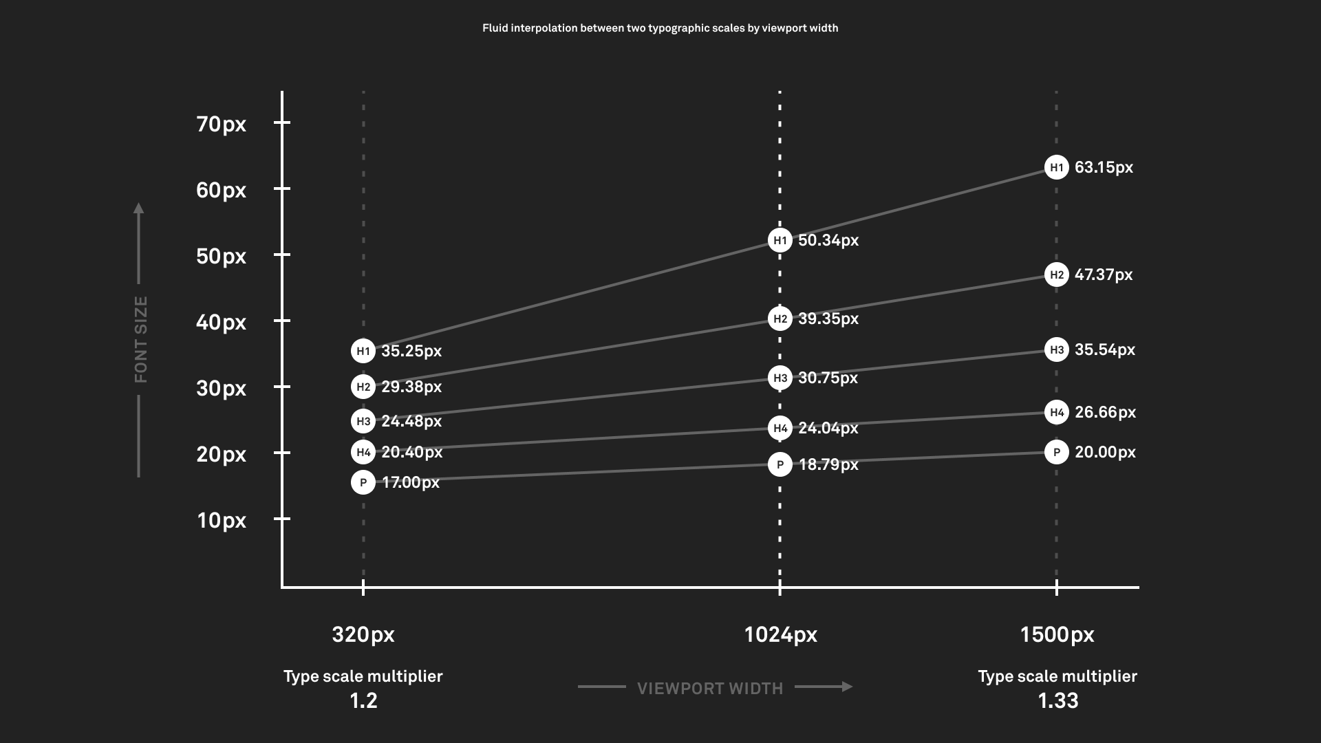
astro-erudite personally uses the following:
- The minimum viewport is 328px,[^1] where the font size should be 16px and the type scale should be 1.125 (major second).
- The maximum viewport is 1215px, where the font size should be 18px and the type scale should be 1.2 (minor third).[^2]
| Scale step | @min (328px) | @max (1215px) |
|---|---|---|
| 3 | 22.78 | 31.10 |
| 2 | 20.25 | 25.92 |
| 1 | 18.00 | 21.60 |
| 0 | 16.00 | 18.00 |
| -1 | 14.22 | 15.00 |
- For minimum width, we ended up "rounding up" to create a perfect grid: > When you design a grid based on a fixed viewport, the sums rarely add up to nice neat whole numbers. Design tools usually compensate by rounding alternating columns up and down, leaving them with whole pixel values but inconsistent widths. If you prefer to design on a perfect grid, you can instead choose to round the container width up or down using the options above.- For maximum width, our maximum viewport was too small for the grid we wanted: > Your @max viewport is set to **1024px**, but the grid generated with this calculator has a max width of **1215px**. You may wish to update your @max viewport to match this calculated value, so your typography and space flex up to this point. If you leave it as is, your type & space will continue to grow/shrink beyond the capped grid.You can find the calculator preset for this particular setup here. It will then generate the following:
:root { /* https://utopia.fyi/type/calculator?c=328,16,1.125,1215,18,1.2,3,1,&s=0.75|0.5|0.25,1.5|2|3|4|6,s-l|s-m&g=s,m,2xl,12 */ --step--1: clamp(0.8889rem, 0.8709rem + 0.0877vw, 0.9375rem); --step-0: clamp(1rem, 0.9538rem + 0.2255vw, 1.125rem); --step-1: clamp(1.125rem, 1.0418rem + 0.4059vw, 1.35rem); --step-2: clamp(1.2656rem, 1.1346rem + 0.6392vw, 1.62rem); --step-3: clamp(1.4238rem, 1.2315rem + 0.9383vw, 1.944rem);11 collapsed lines
--font-weight-normal: 400; --font-weight-medium: 450;
--tracking-tight: -0.015em; --leading-offset: 0.65rem;
--prose-foreground: color-mix(in oklab, var(--foreground) 80%, transparent); --prose-marker: color-mix(in oklab, var(--foreground) 30%, transparent);
--measure: 40rem;}You then can simply assign these in your typography!
Tip
opted for the following:
--step--1→ chrome (visual navigation) elements, subtext,<h5>/<h6>(to disincentivize using them)--step-0→<p>,<h4>--step-1→<h3>--step-2→<h2>--step-3→<h1>
In general, though, you should use --step-0 as your baseline since it is the
step that you actually control. :::
In addition to handling type scaling, the aforementioned poles are also used for spacing! Utopia calls these “t-shirt sizes,” which is quite cute actually.
There are three types of scaling variables that Utopia outputs for you:
- Single-space. These are the self-explanatory base-level space variables.
- Space-value pairs (single-step). If you wish for any particular space to
have a more emphasized scaling effect when interpolated, you can use a
space-value pair! For example,
--space-m-lwill interpolate between M → L from the minimum to maximum poles. - Space-value pairs (arbitrary). You can arbitrarily assign any single-space variable at any pole and have it scale! I personally don’t use this feature, but you can output it.
:root { /* https://utopia.fyi/grid/calculator?c=320,16,1.125,1024,18,1.2,6,1,&s=0.75%7C0.5%7C0.25,1.5%7C2%7C3%7C4%7C6,s-l%7Cs-m&g=s,m,2xl,12 */ --space-3xs: clamp(0.25rem, 0.2269rem + 0.1127vw, 0.3125rem); --space-2xs: clamp(0.5rem, 0.4769rem + 0.1127vw, 0.5625rem); --space-xs: clamp(0.75rem, 0.7038rem + 0.2255vw, 0.875rem); --space-s: clamp(1rem, 0.9538rem + 0.2255vw, 1.125rem); --space-m: clamp(1.5rem, 1.4307rem + 0.3382vw, 1.6875rem); --space-l: clamp(2rem, 1.9076rem + 0.451vw, 2.25rem); --space-xl: clamp(3rem, 2.8613rem + 0.6764vw, 3.375rem); --space-2xl: clamp(4rem, 3.8151rem + 0.9019vw, 4.5rem); --space-3xl: clamp(6rem, 5.7227rem + 1.3529vw, 6.75rem);
--space-3xs-2xs: clamp(0.25rem, 0.1344rem + 0.5637vw, 0.5625rem); --space-2xs-xs: clamp(0.5rem, 0.3613rem + 0.6764vw, 0.875rem); --space-xs-s: clamp(0.75rem, 0.6113rem + 0.6764vw, 1.125rem); --space-s-m: clamp(1rem, 0.7458rem + 1.2401vw, 1.6875rem); --space-m-l: clamp(1.5rem, 1.2227rem + 1.3529vw, 2.25rem); --space-l-xl: clamp(2rem, 1.4915rem + 2.4803vw, 3.375rem); --space-xl-2xl: clamp(3rem, 2.4453rem + 2.7057vw, 4.5rem); --space-2xl-3xl: clamp(4rem, 2.9831rem + 4.9605vw, 6.75rem);
--grid-max-width: 75.94rem; --grid-gutter: var(--space-s-m); --grid-columns: 12;
--page-offset-top: var(--space-xl); --page-offset-bottom: var(--space-m);}These can be used throughout your site’s margin and padding values to create this neat scaling effect. In particular, it is used in Utopia’s fluid grid system, which establishes a set of 12[^3] columns and gutters that scale between your minimum and maximum poles using single-space variables. v2 uses the following configuration:
| Width | @min | @max |
|---|---|---|
| Container | 328px | 1215px |
| Gutter | 16px | 27px |
| Column | 10px | 72px |
We can then establish our grid layout and span sections across it:
<html lang={SITE.locale} dir={SITE.dir}> <MetaHead> <slot name="head" /> </MetaHead> <body> <page-grid> <page-header> <page-nav> <Sidebar crumbs={crumbs}><slot name="actions" slot="actions" /></Sidebar> </page-nav>5 collapsed lines
{ Astro.slots.has("toc") && ( <page-toc><slot name="toc" /></page-toc> ) } </page-header> <page-content> <main><slot /></main> <page-footer><Footer /></page-footer> </page-content> </page-grid> </body></html>
<style> page-grid { position: relative; isolation: isolate; display: grid; grid-template-columns: repeat(var(--grid-columns), minmax(0, 1fr)); gap: calc(var(--grid-gutter)); max-width: var(--grid-max-width); min-height: 100svh; margin-inline: auto; padding-inline: var(--grid-gutter); padding-block-start: var(--page-offset-top); }
page-header { display: contents; } page-nav { grid-column: 1 / 3; grid-row: 1; } page-content { grid-column: 3 / 10; grid-row: 1; } page-toc { grid-column: 10 / 13; grid-row: 1; } /* ... */</style>And that is a complete rundown of astro-erudite’s new design system!
“If not Tailwind’s color system, then what?”
Radix Colors, with each scale carrying a light and dark value per step:
:root { --gray-1: light-dark(#fcfcfc, #111111); --gray-2: light-dark(#f9f9f9, #191919); --gray-3: light-dark(#f0f0f0, #222222); --gray-4: light-dark(#e8e8e8, #2a2a2a); --gray-5: light-dark(#e0e0e0, #313131); --gray-6: light-dark(#d9d9d9, #3a3a3a); --gray-7: light-dark(#cecece, #484848); --gray-8: light-dark(#bbbbbb, #606060); --gray-9: light-dark(#8d8d8d, #6e6e6e); --gray-10: light-dark(#838383, #7b7b7b); --gray-11: light-dark(#646464, #b4b4b4); --gray-12: light-dark(#202020, #eeeeee);
--red-9: light-dark(#e5484d, #e5484d); --red-11: light-dark(#ce2c31, #ff9592);
--background: var(--gray-1); --foreground: var(--gray-12); --primary: var(--gray-12); --primary-foreground: var(--gray-1); --muted: var(--gray-3); --muted-foreground: var(--gray-11); --destructive: var(--red-11); --border: var(--gray-6); --ring: var(--gray-8);
color-scheme: light dark;}We now use
[light-dark(){:css}](https://developer.mozilla.org/en-US/docs/Web/CSS/Reference/Values/color_value/light-dark)
here instead of Tailwind’s [dark:*](https://tailwindcss.com/docs/dark-mode)
variant. We do still need to use a little bit of JavaScript to handle saving the
user’s color scheme if they hit the toggle button. However, upon first load
astro-erudite will always respect system preference.
“If not Tailwind’s […], then what?”
This is a bunch of miscellaneous Tailwind stuff we have actually kept in some capacity:
- For its CSS reset (a CSS reset serves to minimize cross-browser
inconsistencies), we do still actually use
Preflight, but it’s simply vendored
in as
reset.css. - For its various utilities with nice numbers, I’ve hand-selected some in
shape.cssfor use cases like when we need border radius or backdrop blurs.
Regarding typography
As you might have noticed, astro-erudite is now using a new font! We’re now on IBM Plex Sans and IBM Plex Mono. Historically, IBM Plex Sans was commissioned by IBM to replace Helvetica Neue (arguably one of the greatest fonts of all time). These two replace Geist Sans/Mono in part because Geist (and likewise, Inter) have been overused to the moon and back.
Some other readability changes:
-
I personally despise heavy font weights. I also despise thin weights. Since astro-erudite is, of course, opinionated, I’ve decided to exclusively ship only the 400 (normal) and 500 (medium) weights of IBM Plex Mono. For IBM Plex Sans, a variable font, I’ve made it so that there are no instances of weights other than 400 and 450 (not 500!) throughout v2. I almost always prefer establishing hierarchy through opacity rather than weight: headers and links should get 100%, prose should get 80%, and muted text should get 60%.
-
Due to Utopia, desktop devices now get big 18px fonts, and mobile devices get 16px fonts. v1 had 16px on desktop, and it just stayed like that.
-
In regards to line height, all lines now use the following computation:
--leading-offset: 0.65rem;line-height: calc(var(--leading-offset) + 1em);Instead of some unitless multiplier number, we now additively add a constant offset (0.65rem) to each element’s own font size (1em). This keeps a roughly constant gap between lines regardless of text size, so headings stay tight and body text stays comfortable without needing a separate line-height rule for every heading and paragraph.
-
We now use
max-inline-size: var(--measure)where--measure: 40rem. 40rem makes the overall content width narrower and nicer to read. -
For the specific task of importing fonts via
@font-face, you may notice that there’s a couple of weird entries:src/styles/fonts.css @font-face {font-family: "IBM Plex Sans";src: url("../assets/fonts/IBMPlexSans-LatinExt-VariableFont_wght.woff2")format("woff2");font-weight: 100 700;font-style: normal;font-display: swap;unicode-range: U+0100-02FF, U+0300-036F, U+1D00-1DBF, U+1E00-1EFF,U+20A0-20C0, U+2C60-2C7F, U+A720-A7FF;9 collapsed lines}@font-face {font-family: "IBM Plex Sans";src: url("../assets/fonts/IBMPlexSans-LatinExt-Italic-VariableFont_wght.woff2")format("woff2");font-weight: 100 700;font-style: italic;font-display: swap;unicode-range: U+0100-02FF, U+0300-036F, U+1D00-1DBF, U+1E00-1EFF,U+20A0-20C0, U+2C60-2C7F, U+A720-A7FF;}@font-face {font-family: "IBM Plex Sans Fallback";src: local("Arial");font-weight: 100 700;font-style: normal;size-adjust: 101.1663%;11 collapsed linesascent-override: 101.3184%;descent-override: 27.183%;line-gap-override: 0%;}@font-face {font-family: "IBM Plex Sans Fallback";src: local("Arial");font-weight: 100 700;font-style: italic;size-adjust: 101.1663%;ascent-override: 101.3184%;descent-override: 27.183%;line-gap-override: 0%;}- The former entries involve a
LatinExt(Latin Extended) font. The goal is to support the rendering of Latin-based characters in other languages, e.g. Spanish, French, Vietnamese, German, Polish, etc. It also allows me to properly render the IPA pronunciation of erudite (/ˈer(y)əˌdīt/) so that I can put a cool dictionary definition on the homepage of this template. - The latter entries involve a fallback font. I manually specify
local("Arial")as the fallback, but then I also specify these weird adjustments to ascenders, descenders, and sizing. These were actually automatically generated by Astro’s Fonts API (which I intentionally didn’t use because its syntax was clunky for minimal benefit).
- The former entries involve a
The typography files themselves have also dramatically changed. Instead of
throwing everything into global.css and typography.css (this file was
atrocious in v1, and used !important 9 (!!!) times), we now divide CSS
files into their responsibilities: color, layout, fonts, shape, etc. For
specifically typography, we additionally divide it into the following: headings,
lists, tables, block (block-level elements, e.g. tables, figures, codeblocks),
and inline (inline-level elements, e.g. links, {:html}, inline code). Although
this has resulted in many new files, each file is readable and low cortisol to
look at, and is focused in intents and purposes.
Regarding MDX
v2 no longer ships with the @astrojs/mdx package/mdx() plugin by
default. This is one of my more debatable decisions, so I should explain myself
a little bit.
The entire point of MDX is to provide an easy way to write interactive components inside of your prose. Here is one now:
There’s actually no MDX involved here! You’re reading a regular .md file. That
button is an
autonomous custom element
defined a few lines up in this exact document, which works because raw HTML
(including ` passes straight through the Markdown pipeline:
<click-counter></click-counter>
<script>if (!customElements.get("click-counter")) {  customElements.define(    "click-counter",    class extends HTMLElement {      connectedCallback() {        let count = 0;        const button = document.createElement("button");        button.textContent = "Clicked 0 times";        button.addEventListener("click", () => {          button.textContent = `Clicked ${++count} times`;        });        this.append(button);      }    },  );}</script>
Note
astro-erudite has
View Transitions,
it re-runs body scripts across page swaps, and customElements.define()
throws if the name is already registered. :::
A plethora of other benefits also comes with unchaining ourselves from the React ecosystem like this:
- Removing
@astrojs/mdxalso drops our dependency tree by 51 packages (more packages than everything v2 stacks on top of Astro!). - JSX syntax is a lot less forgiving for both humans and compilers. Non-technical writers find it harder to write valid JSX, and embedded JSX can also fail entire builds. In general, rendering it is heavier.
- Your blogs are now dramatically more portable and universal to different platforms!
I also want to reiterate that you are completely free to install it yourself if you need it. If your blog leans heavily into interactive playgrounds, MDX with a framework island is still the right tool. I just no longer am convinced its weight is worth it to be a default for a personal blog.
“But what about callouts?”
I don’t know why I ever thought this was in any way ergonomic, but in v1 any time you wanted to add a callout you would have to import it at the top of your file and call it like this:
import Callout from '@/components/callout.astro'
<Callout title="Testing" variant="note">  Hello, world!</Callout>
v2 ships with the Sätteri Markdown processor, which supports directives with the same specification as remark-directive. We now can add callouts to our Markdown content like this, without any imports:
:::note[Testing] Hello, world! :::This renders as:
Note (Testing)
We do this with a custom MDAST plugin that hooks into Sätteri, rather than an Astro component. Do note that this is one of the breaking changes from v1 to v2.
Regarding unified and Sätteri
With the release of Astro 6.4, a new
markdown.processor API was added that allows you to swap out the entire
unified pipeline. An official alternative was added,
Sätteri, a Markdown/MDX processor written in
Rust. Of course, it’s very fast (switching the Astro and Cloudflare docs sites
over reportedly shaved a minute off each of their builds), but the real reason
why I switched was because I wanted to get off of rehype/remark so badly.
For reference, this was v1’s Markdown setup. It was a set of seven different
plugins stacked ridiculously like Tetris pieces into this single object (don’t
even mention the giant styleOverrides block):
markdown: { syntaxHighlight: false, rehypePlugins: [ [ rehypeExternalLinks, { target: '_blank', rel: ['nofollow', 'noreferrer', 'noopener'], }, ], rehypeHeadingIds, rehypeKatex, [ rehypeExpressiveCode, { themes: ['github-light', 'github-dark'], plugins: [pluginCollapsibleSections(), pluginLineNumbers()], useDarkModeMediaQuery: false, themeCssSelector: (theme: ExpressiveCodeTheme) => `[data-theme="${theme.name.split('-')[1]}"]`, defaultProps: { wrap: true, collapseStyle: 'collapsible-auto', overridesByLang: { 'ansi,bat,bash,batch,cmd,console,powershell,ps,ps1,psd1,psm1,sh,shell,shellscript,shellsession,text,zsh': { showLineNumbers: false, }, }, }, styleOverrides: {25 collapsed lines
codeFontSize: '0.75rem', borderColor: 'var(--border)', codeFontFamily: 'var(--font-mono)', codeBackground: 'color-mix(in oklab, var(--muted) 25%, transparent)', frames: { editorActiveTabForeground: 'var(--muted-foreground)', editorActiveTabBackground: 'color-mix(in oklab, var(--muted) 25%, transparent)', editorActiveTabIndicatorBottomColor: 'transparent', editorActiveTabIndicatorTopColor: 'transparent', editorTabBorderRadius: '0', editorTabBarBackground: 'transparent', editorTabBarBorderBottomColor: 'transparent', frameBoxShadowCssValue: 'none', terminalBackground: 'color-mix(in oklab, var(--muted) 25%, transparent)', terminalTitlebarBackground: 'transparent', terminalTitlebarBorderBottomColor: 'transparent', terminalTitlebarForeground: 'var(--muted-foreground)', }, lineNumbers: { foreground: 'var(--muted-foreground)', }, uiFontFamily: 'var(--font-sans)', }, }, ], [ rehypeShiki, { themes: { light: 'github-light', dark: 'github-dark', }, inline: 'tailing-curly-colon', }, ], ], remarkPlugins: [remarkMath, remarkEmoji],},The order of operations within this setup also mattered (e.g. some plugins must
show up later in the chain than others), which made it even more brittle. Not
only this, but notice how v1 had two separate syntax highlighters with two
separate configuration options: rehype-expressive-code for code blocks, and
rehype-shiki for inline code. This was the workaround for the longest time,
because Expressive Code only supported highlighting code blocks.
v2’s Markdown configuration now looks like this:
markdown: { syntaxHighlight: false, processor: satteri({ features: { directive: true, math: true }, mdastPlugins: [calloutDirective, inlineExpressiveCode, temmlMath], hastPlugins: [externalLinks, blockExpressiveCode, headingNamespace], }),},Every single plugin in mdastPlugins and hastPlugins is a file in src/lib
that I wrote myself. Sätteri doesn’t run remark or rehype plugins at all, but
rather has its own plugin API where a plugin is just an object with a name and
a visitor per node type, operating on either the MDAST (Markdown semantics:
headings, lists, directives) or the HAST (HTML semantics: tags, attributes).
This seems like a downside (since I’m willingly walking away from many years of
mature ecosystem plugins) until you see how great the porting experience
actually is.
From here, I will talk about each of the six plugins that I’ve created and shipped with v2. Since Sätteri is still incredibly young (as of this blog post, it came out two weeks ago), in the future there will likely be official companion plugins/dependencies that do just this, but for now we have maximum ownership and, thus, maximum flexibility.
Rendering external links
We sort this section from trivial to nontrivial. The most basic of these is my
external-links plugin, and its sole purpose is to add target="_blank"
and rel="nofollow noreferrer noopener" to links. We do this via the
HAST:
import { defineHastPlugin } from "satteri";
export const externalLinks = defineHastPlugin({ name: "external-links", element: { filter: ["a"], visit(node, ctx) { const href = node.properties.href; if (typeof href === "string" && /^https?:\/\//.test(href)) { ctx.setProperty(node, "target", "_blank"); ctx.setProperty(node, "rel", "nofollow noreferrer noopener"); } }, },});Namespacing headings
This plugin is responsible for namespacing headings within posts that have subposts (which I talk about in Regarding subposts, since this system has also been completely overhauled). This is so that in the case where multiple subposts share the same heading, the headings are differentiated by prepending the post’s file name to the ID. We do this via the HAST:
import GithubSlugger from "github-slugger";import { defineHastPlugin } from "satteri";
const SUBPOST = /\/blog\/[^/]+\/(?!index\.mdx?$)([^/]+)\.mdx?$/;
export function headingNamespace() { const slugger = new GithubSlugger(); return defineHastPlugin({ name: "heading-namespace", element: { filter: ["h1", "h2", "h3", "h4", "h5", "h6"], visit(node, ctx) { const match = SUBPOST.exec(ctx.filename); if (!match) return; ctx.setProperty( node, "id", `${match[1]}-${slugger.slug(ctx.textContent(node))}`, ); }, }, });}Two details make this plugin work:
- It’s exported as a factory function rather than a plain plugin object.
Sätteri accepts both, but a factory is re-invoked for every document, which
gives each post a fresh slugger (
github-sluggerdeduplicates within an instance, so a shared one would leakintroduction-1,introduction-2, … across posts). - Heading IDs aren’t actually generated by Sätteri itself. They come from
@astrojs/markdown-satteri, which appends its own slugging plugin at the very end of the HAST plugin chain. Crucially, that built-in plugin respects anyidthat already exists and passes it unchanged, meaning that I can claim the ID first.
Rendering math
v1 rendered LaTeX through remark-math and rehype-katex.
KaTeX outputs a mountain of nested <span>
elements that are completely meaningless without its stylesheet, so v1 also
shipped a script that watched every page swap and injected katex.min.css (and,
transitively, whichever of its fonts the page needed) from a CDN whenever it
spotted a .katex element. This was a ridiculous approach and I’m sorry for
this.
v2 renders LaTeX through Temml, which outputs MathML. Since MathML is actually browser-native (it became Baseline in 2023), we no longer need to inject a CSS file and instead just need to bring along a math font! STIX Two Math is a great choice (and the default for macOS). Here is the plugin, done with the MDAST:
import { defineMdastPlugin } from "satteri";import temml from "temml";
const err = (e: unknown) => (e instanceof Error ? e.message : String(e));
export function temmlMath() { return defineMdastPlugin({ name: "temml-math", inlineMath(node, ctx) { try { const value = temml.renderToString(node.value, { throwOnError: false }); return { type: "html", value }; } catch (error) { ctx.report({ message: `temml-math: failed on \`${node.value}\`: ${err(error)}`, node, severity: "warning", }); } }, math(node, ctx) { try { const value = temml.renderToString(node.value, { displayMode: true, throwOnError: false, }); return { type: "html", value: `<math-display>${value}</math-display>` }; } catch (error) { ctx.report({ message: `temml-math: failed on \`${node.value}\`: ${err(error)}`, node, severity: "warning", }); } }, });}Math syntax ($...$ and $$...$$) is its own Sätteri feature flag, which is
why math: true sits next to directive: true in the config. The
plugin hands the TeX to Temml and returns the raw MathML back into the tree, and
block-level math additionally gets wrapped in a <math-display> custom
element so the stylesheet has something to center and horizontally scroll:
Rendering callouts
This is the plugin I promised back in
“But what about callouts?”. With the flag on,
Sätteri parses ::: blocks into containerDirective (as opposed to inline :
and leaf ::) MDAST nodes and then leaves them for someone to handle:
37 collapsed lines
import { readFileSync } from "node:fs";import { dirname, join } from "node:path";import { fileURLToPath } from "node:url";import type { ElementContent } from "hast";import { toHtml } from "hast-util-to-html";import { h } from "hastscript";import { defineMdastPlugin } from "satteri";
const ICONS_DIR = join( dirname(fileURLToPath(import.meta.url)), "../assets/icons/callouts",);
const loadIcon = (name: string) => readFileSync(join(ICONS_DIR, `${name}.svg`), "utf8") .replace("<svg", '<svg aria-hidden="true"') .replace(/\s+/g, " ") .trim();
const VARIANTS: Record<string, string> = { note: "info-circle", tip: "lightbulb", warning: "danger-triangle", caution: "shield-warning", important: "bell",};
const icons: Record<string, string> = {};for (const name of [...new Set(Object.values(VARIANTS)), "alt-arrow-down"]) { icons[name] = loadIcon(name);}
const capitalize = (s: string) => s.charAt(0).toUpperCase() + s.slice(1);
const raw = (value: string): ElementContent => ({ type: "raw", value }) as unknown as ElementContent;
export function calloutDirective() { return defineMdastPlugin({ name: "callout-directive", containerDirective(node, ctx) { const iconName = VARIANTS[node.name]; if (!iconName) return;
const first = node.children[0]; const isLabel = first?.type === "paragraph" && (first.data as { directiveLabel?: boolean })?.directiveLabel === true; const label = isLabel ? ctx.textContent(first) : null; if (isLabel) ctx.removeNode(first);
const title: ElementContent[] = [ { type: "text", value: capitalize(node.name) }, ]; if (label) title.push(h("span", ` (${label})`));
const summary = toHtml( h("summary", [ raw(icons[iconName]), h("span", title), raw(icons["alt-arrow-down"]), ]), { allowDangerousHtml: true }, );
const closed = !!node.attributes && "closed" in node.attributes;
ctx.prependChild(node, { type: "html", value: summary }); ctx.setProperty(node, "data", { hName: "details", hProperties: { dataCallout: node.name, open: !closed, }, }); }, });}The five variants defined in the plugin are derived from
GitHub alerts
(note, tip, warning, caution, important). Because they’re real
<details> elements, every callout you’ve seen in this post is natively
collapsible with exactly zero JavaScript, and appending {closed} to the
directive makes one start out collapsed.
There are some clever things behind-the-scenes that make this all work very elegantly:
- The icons are Solar SVGs read off the disk at build time and inlined straight into the HTML, so we need no client-side fetching of icons and no icon library.
- Each
data-calloutvariant only needs a single color defined for--accent, and then legible colors are automatically derived for both light and dark mode with some small modifications to lightness and chroma:
prose-content { [data-callout] { --accent: var(--muted-foreground); --callout-border: var(--accent); --callout-text: light-dark( oklch(from var(--accent) 0.48 calc(c * 1.05) h), oklch(from var(--accent) 0.83 calc(c * 0.5) h) );55 collapsed lines
position: relative; padding-block: 0.75rem; padding-inline: 1rem 0; border-inline-start: 4px solid var(--callout-border);
> summary { display: flex; align-items: center; cursor: pointer; list-style: none; font-weight: 500; color: var(--callout-text);
&::-webkit-details-marker { display: none; }
svg { flex-shrink: 0; inline-size: 1.25rem; block-size: 1.25rem; }
svg:first-child { margin-inline-end: 0.5rem; }
svg:last-child { margin-inline-start: auto; }
> span { margin-inline-end: 0.5rem;
> span { font-weight: 400; opacity: 0.7; } } }
&[open] > summary { margin-block-end: 0.75rem;
svg:last-child { transform: rotate(180deg); } }
> :last-child { margin-block-end: 0; } }
[data-callout="note"] { --accent: #0090ff; } [data-callout="tip"] { --accent: #30a46c; } [data-callout="warning"] { --accent: #ffc53d; } [data-callout="caution"] { --accent: #e5484d; } [data-callout="important"] { --accent: #8e4ec6; }}Highlighting code blocks
Code blocks are still rendered by
Expressive Code, because nothing else comes
close (text markers, collapsible sections, ANSI color code rendering, line
numbers, and the editor and terminal frames). Crazily, the first companion
plugin the Sätteri team shipped was
[satteri-expressive-code](https://www.npmjs.com/package/satteri-expressive-code)
(it exists in the same monorepo as Sätteri itself), so my “plugin” here is nine
lines of wiring:
import expressiveCode from "satteri-expressive-code";import { ecRenderer } from "./config";import { inlineExpressiveCode } from "./inline";
export const blockExpressiveCode = expressiveCode({ customCreateRenderer: () => ecRenderer,});
export { inlineExpressiveCode };The configuration (the one with the giant styleOverrides block I told you not
to worry about) now, thankfully, gets shooed away in its own file instead of
being crammed into astro.config.ts, and every override points at a custom
property from the design system, so code blocks scale fluidly with Utopia and
follow the theme toggle like everything else on the page:
import { pluginCollapsibleSections } from "@expressive-code/plugin-collapsible-sections";import { pluginLineNumbers } from "@expressive-code/plugin-line-numbers";import { createRenderer, type SatteriExpressiveCodeOptions,} from "satteri-expressive-code";
export const ecOptions: SatteriExpressiveCodeOptions = { themes: ["github-light", "github-dark"], useDarkModeMediaQuery: true, themeCssSelector: (theme) => `[data-theme="${theme.name === "github-dark" ? "dark" : "light"}"]`, plugins: [pluginCollapsibleSections(), pluginLineNumbers()],45 collapsed lines
defaultProps: { wrap: true, showLineNumbers: true, collapseStyle: "collapsible-auto", overridesByLang: { "ansi,bat,bash,batch,cmd,console,powershell,ps,ps1,psd1,psm1,sh,shell,shellscript,shellsession,text,zsh": { showLineNumbers: false, }, }, }, styleOverrides: { codeFontSize: "var(--step--1)", codeFontFamily: "var(--font-mono)", codeBackground: "color-mix(in oklab, var(--muted) 25%, transparent)", borderColor: "var(--border)", borderRadius: "0", uiFontFamily: "var(--font-sans)", lineNumbers: { foreground: "var(--muted-foreground)", }, frames: { editorActiveTabForeground: "var(--muted-foreground)", editorActiveTabBackground: "transparent", editorActiveTabIndicatorBottomColor: "transparent", editorActiveTabIndicatorTopColor: "transparent", editorTabBorderRadius: "0", editorTabBarBackground: "transparent", editorTabBarBorderBottomColor: "transparent", frameBoxShadowCssValue: "none", terminalBackground: "color-mix(in oklab, var(--muted) 25%, transparent)", terminalTitlebarBackground: "transparent", terminalTitlebarBorderBottomColor: "transparent", terminalTitlebarForeground: "var(--muted-foreground)", }, textMarkers: { backgroundOpacity: "25%", borderOpacity: "25%", defaultChroma: "50", lineMarkerLabelColor: "var(--foreground)", }, collapsibleSections: { closedFontFamily: "var(--font-sans)", }, },};
export const ecRenderer = createRenderer(ecOptions);The line that actually matters here is customCreateRenderer. If we had
left it alone, the plugin would create its own private Expressive Code renderer.
Instead, we create the renderer ourselves and hand it over, because we’ll need
to borrow it in the next section.
Highlighting inline code
This plugin is the most complicated of the six, and my personal favorite. As
mentioned before, v1 ran two separate highlighters because Expressive Code only
handles fenced code blocks (rehype-expressive-code for blocks, and
@shikijs/rehype for inline code), each with its own Shiki instance and its own
theme configuration to keep in sync. This has been a massive pain point for me
for over a year now (I opened
this abandoned issue
and prompted
this stale PR,
and I even wrote a small blog post on patching the plugin behavior:
v1.3.0: “Patches in Production”).
v2 keeps @shikijs/rehype’s annotation syntax, an inline snippet ending in
{:lang} (they call this a “tailing curly colon”):
The `mdx(){:ts}` plugin is gone.The major difference is that it now feeds through the exact same renderer as the
code blocks. When the plugin sees an annotated inline code node, it constructs a
one-line ExpressiveCodeBlock, renders it with the shared renderer from
config.ts, plucks the highlighted tokens out of the result, and throws the
rest of the frame away:
13 collapsed lines
import type { ElementContent } from "hast";import { toHtml } from "hast-util-to-html";import { select } from "hast-util-select";import { h } from "hastscript";import type { Html } from "mdast";import { defineMdastPlugin } from "satteri";import { type ExpressiveCode, ExpressiveCodeBlock, type ExpressiveCodeTheme,} from "satteri-expressive-code";import { ecRenderer } from "./config";
const ANNOTATION = /^(.+?)\{:([^}]+)\}$/;
type Annotation = | { kind: "lang"; code: string; lang: string } | { kind: "scope"; code: string; scope: string };
function parseAnnotation(value: string): Annotation | null { const match = ANNOTATION.exec(value); if (!match) return null; const [, code, tag] = match; if (!code || tag === ".") return null; return tag.startsWith(".") ? { kind: "scope", code, scope: tag.slice(1) } : { kind: "lang", code, lang: tag };}
async function highlightLanguage( ec: ExpressiveCode, code: string, lang: string,): Promise<ElementContent[]> { const block = new ExpressiveCodeBlock({ code, language: lang }); const { renderedGroupAst } = await ec.render(block); const tokens = select(".ec-line .code", renderedGroupAst)?.children; return tokens ?? [{ type: "text", value: code }];}
20 collapsed lines
function highlightScope( ec: ExpressiveCode, code: string, scope: string,): ElementContent[] { const [light, dark] = ec.styleVariants; const c0 = resolveScopeColor(light.theme, scope); const c1 = resolveScopeColor(dark.theme, scope); return [h("span", { style: `--0:${c0};--1:${c1}` }, code)];}
function resolveScopeColor(theme: ExpressiveCodeTheme, scope: string): string { const best = (theme.settings ?? []) .flatMap((rule) => (rule.scope ?? []).map((s) => ({ s, fg: rule.settings.foreground })) ) .filter(({ s, fg }) => fg && (scope === s || scope.startsWith(`${s}.`))) .sort((a, b) => b.s.length - a.s.length)[0]; return best?.fg ?? theme.fg;}
export function inlineExpressiveCode() { return defineMdastPlugin({ name: "inline-expressive-code", async inlineCode(node, ctx) { const annotation = parseAnnotation(node.value); if (!annotation) return;
try { const { ec } = await ecRenderer; const tokens = annotation.kind === "lang" ? await highlightLanguage(ec, annotation.code, annotation.lang) : highlightScope(ec, annotation.code, annotation.scope); const dataLanguage = annotation.kind === "lang" ? annotation.lang : undefined;
const value = toHtml(h("code", { dataEc: "", dataLanguage }, tokens)); return { type: "html", value } satisfies Html; } catch (error) { const reason = error instanceof Error ? error.message : String(error); ctx.report({ message: `inline-expressive-code: failed on \`${node.value}\`: ${reason}`, node, severity: "warning", }); } }, });}Now that we have a single highlighter, we only need a single configuration for
both code blocks and inline code, and they will never drift out of sync with
each other again. There’s even the added bonus that you can use
TextMate scopes, so I can
paint anything with whatever color the active theme assigns to
strings!
And that is the entire v2 Markdown pipeline!
Regarding subposts
Subposts were one of the most important features of v1. They allowed you to compartmentalize content into smaller and more digestible pieces, and allowed you to establish a chain of related content. Although I am speaking of it in past tense like I mysteriously decided to remove it in v2, it’s not going anywhere! I just made it infinitely better to use.
Within v1, a subpost was its own standalone page. You’d read the parent, then click into part one, then click into part two, and so on. Since every part was a separate URL with separate content, I had to build three different navigational components so that you never felt lost:
- A sticky sidebar listing the series on desktop (
SubpostsSidebar.astro) - A collapsible dropdown on mobile (
SubpostsHeader.astro) - A special three-column previous/parent/next footer
In addition to a lot of modified post metadata (aggregated “total” reading
times, and “x subposts” count badges on blog cards), those two components alone
were 581 lines, and a third of the functions in data-utils.ts existed just to
serve them.
We approach this concept in v2 very differently. Rather than splitting into separate pages for each subpost, we now have a single continuous document. Every URL in the series renders the parent and every subpost, top to bottom. The only difference between the URLs is where you land. Now, you navigate through subposts simply by scrolling, and your scrollbar is the navigational tool.
If you wish to see a live demo, the v1 posts on this website have been archived as a series, which means the v1.6.0 post that originally announced subposts is now itself a subpost. Open it and watch the address bar as you scroll.
I’ve avoided changing the authoring experience (a folder with an index.md and
its sibling subposts, plus an optional order field in the frontmatter). What
has changed is the route generation, which now builds one identical “chain” of
articles and emits it once per URL:
export async function getStaticPaths() { const posts = await getPosts(); const series = await getSubposts(); return posts.flatMap((parent, i) => { const chain = [parent, ...(series.get(parent.id) ?? [])]; return chain.map((post) => ({ params: { id: post.id }, props: { post, chain, prev: posts[i + 1], next: posts[i - 1] }, })); });}From there, a small script updates your address bar. An
IntersectionObserver watches a thin band near the top of the viewport,
and whenever a different article in the chain crosses it, the URL and tab title
silently swap to match what you’re reading. Of course, this is bidirectional:
const { url, title } = current.dataset;if (url && trimSlash(location.pathname) !== url) { history.replaceState(history.state, "", url + hash); if (title) document.title = title; syncCrumb(current);}Incidentally, several benefits come from switching to this design:
- Each subpost URL is unique, so deep links work exactly as expected. You will be scrolled to that article in the series before first paint.
- Since every URL in a series shares the same body, the scroll position Astro
stores in
history.stateis valid on all of them, so reloading or hitting the back button restores the exact spot where you were reading! - Subpost URLs now declare a
<link rel="canonical">pointing at the parent, so search engines don’t index the same document multiple times. - Only the article you landed on gets an eagerly-loaded banner image; every other banner in the chain lazy-loads.
- We can entirely rid ourselves of
SubpostsSidebar.astroandSubpostsHeader.astroby simply combining them withTableOfContents.astro. The table of contents now outlines the entire series, with a collapsible group per subpost. The collapsible group will open when you enter a new subpost, but will not close behind you when you leave the post you were coming from.
Important
ships the HTML of the entire series. I’m fine with this, as HTML compresses extremely well, and images (the actual heavy part) are lazy. :::
Regarding UI/UX
The rest of the changes are smaller interface decisions that don’t individually deserve a full section, so here they are rapid-fire:
- The header is now a sidebar. I’ve come to dislike headers in the past
couple of months, as I felt they were obstructing the vertical flow of
content. On desktop, v1 had both this header and a breadcrumb on every page.
On mobile, you could have up to three headers if you were on a post with
subposts. v2 merges the navigation and breadcrumb into what is effectively a
tiny file tree! I feel that this is an intuitive approach to navigating
websites, especially with the indentation. Below 64rem (when there’s no longer
room for it) the sidebar flattens back into a top bar.
- There is exactly one table of contents. v1 shipped both a
toc-sidebar.astrofor desktop andtoc-header.astrofor mobile. v2 renders both out of a singleTableOfContents.astrothanks to our new Utopian grid! It comes with the same nice features as before (multi-section highlighting, automatic scrolling on long pages), but additionally adds collapsible subpost dropdowns for when posts have them.
- There is exactly one table of contents. v1 shipped both a
- Pagination is dead. v1 chopped the blog index into pages of three posts
and walked you between them with a shadcn/ui
<Pagination>component. Nobody has ever wanted to be on page 4 of a personal blog. v2 puts every post on one page and lets you scroll because pagination never made sense in the first place for that scale. - The about page is also dead. You should probably use your homepage as an about me section rather than tucking it away. Projects, which were previously squatting at the bottom of the about page, have been promoted to their own /projects route!
- We can now mix-and-match icons! v1 originally used Lucide through its three separate icon packages. In a similar vein to Geist’s removal, Lucide has been ridiculously overused in the last couple of years, and readers deserve something a little bit more fresh. Since we no longer depend on icon libraries, we no longer have any particular loyalty to a specific icon set and can now mix and match! I mainly used Solar’s Bold variant, but for the navigation arrows I used Phosphor and for the theme toggle I used Akar Icons.
- Better post navigation and quality-of-life. Rather than having two copies of previous/next buttons at the top and bottom of the page (which is what v1 did), the sidebar layout now allows for a persistent set of action buttons on the bottom left: the theme toggle, prev/next buttons, and a “scroll to top” button that only appears when the user scrolls enough down the page.
Breaking changes
v2 is a really big rewrite. Design-wise, if you have a customized v1 fork, I would highly suggest not attempting to pull v2 into it. My suggestion here would actually be to send the diff between your v1 fork and v1 baseline to an agent and then have it replicate those changes on a fresh v2.
Content-wise, ensure you (or your agent) are aware of the following caveats when porting a v1 post to v2:
**.mdxfiles are no longer collected.** The content loader’s glob is**/[^_]*.mdnow (the[^_]also lets you hide a file from the loader entirely by prefixing it with an underscore).- Ensure you convert all instances of
<Callout>to[:::directives](#but-what-about-callouts), and interactive components to custom elements with a<script>tag. - If your content is too interactive and needs framework islands, install
@astrojs/mdxback and re-add.mdxto your glob.
- Ensure you convert all instances of
**authorsis now required, and it’s a real reference.** v1’s frontmatter field was an optional array of strings that simply hoped a matching author file existed. v2 usesreference("authors"), so every post must declare its authors and the build fails loudly when one points at nothing. This removes the concept of “guest” authors, or authors that never resolve.- Author socials are now collapsed into one field.
website,twitter,github,linkedin, anddiscordare no longer five hardcoded schema fields, but a singlesocialsrecord mapping any label to a URL. You are no longer limited to the five networks I happened to think of in 2024. - Emoji shortcodes are gone.
remark-emojileft with the rest of the unified pipeline, so:wink:renders as its literal syntax. Your operating system has an emoji picker. 😉 - Math renders to MathML. The
$...$and$$...$$syntax is unchanged, but KaTeX-specific macros and extensions won’t necessarily exist in Temml’s support table. In practice the overlap covers everything a blog post actually uses, so this shouldn’t be a problem. - Heading anchors inside subposts moved. A series is one continuous document
now, so subpost headings get namespaced IDs to avoid collisions
(
#introductioninsidedeploy.mdbecomes#deploy-introduction). Old deep links to subpost headings will land on the right page but not scroll to the right spot. - Some URLs no longer exist.
/aboutis gone (projects moved to/projects), and the paginated/blog/2,/blog/3, … pages are now also gone. If you care about inbound links to these, Astro’s[redirects](https://docs.astro.build/en/guides/routing/#redirects)config has you covered. **consts.tswas reshaped a little bit.**NAV_LINKSis nowNAVIGATION,SOCIAL_LINKSis nowSOCIALSand imports its SVG icons directly, andICON_MAPis gone because there is no icon library left to map into!SITElostpostsPerPageandhref, and gaineddirplusdefaultPageImageanddefaultPostImage.- Your Tailwind customizations have nowhere to go. This unfortunately is the painful one. Any classes you’ve layered onto v1 components have to be rewritten as actual CSS against the new design system. I genuinely believe the result will be smaller and more legible than what you had, but there is work to be done. Please defer to your local coding agent for guidance!
- Your remark and rehype plugins won’t run. Any remark or rehype plugins you
depend on will need to be ported to
Sätteri’s plugin API. Thankfully, you have
six plugins in
src/libthat you can use as reference implementations.
Conclusion
I am very aware of the irony of doing all of this knowing full well that in another two years my taste will have shifted yet again and I’ll be drafting v3. I think this is totally fine! I’ve always wanted astro-erudite to be a realistic snapshot of my current preferences and judgement. I think it’s a great way to show my growth as a developer.
If you are on the fence about creating a personal blog, I implore you to give it a try. I’m not even telling you this just because I want you to use this template (I don’t make any money off this), but rather because I want to spread the joy of simply creating your own space. On your own website, you can write whatever you want and build whatever you want. Everything exists on your terms. You might think that you don’t like writing because you were forced to write argumentative essays about To Kill a Mockingbird or Shakespeare or whatever in middle school. You are not bound by any constraints here; on my blog I exclusively wrote about cybersecurity until I went on vacation one time and returned home as a travel blogger. Writing about things you actually love is addicting and a great way to express yourself and your voice!
astro-erudite is open-source on my GitHub. If you’ve built something with v1 these past two years, thank you. This is my gift to you! :)